Sports Illustrated
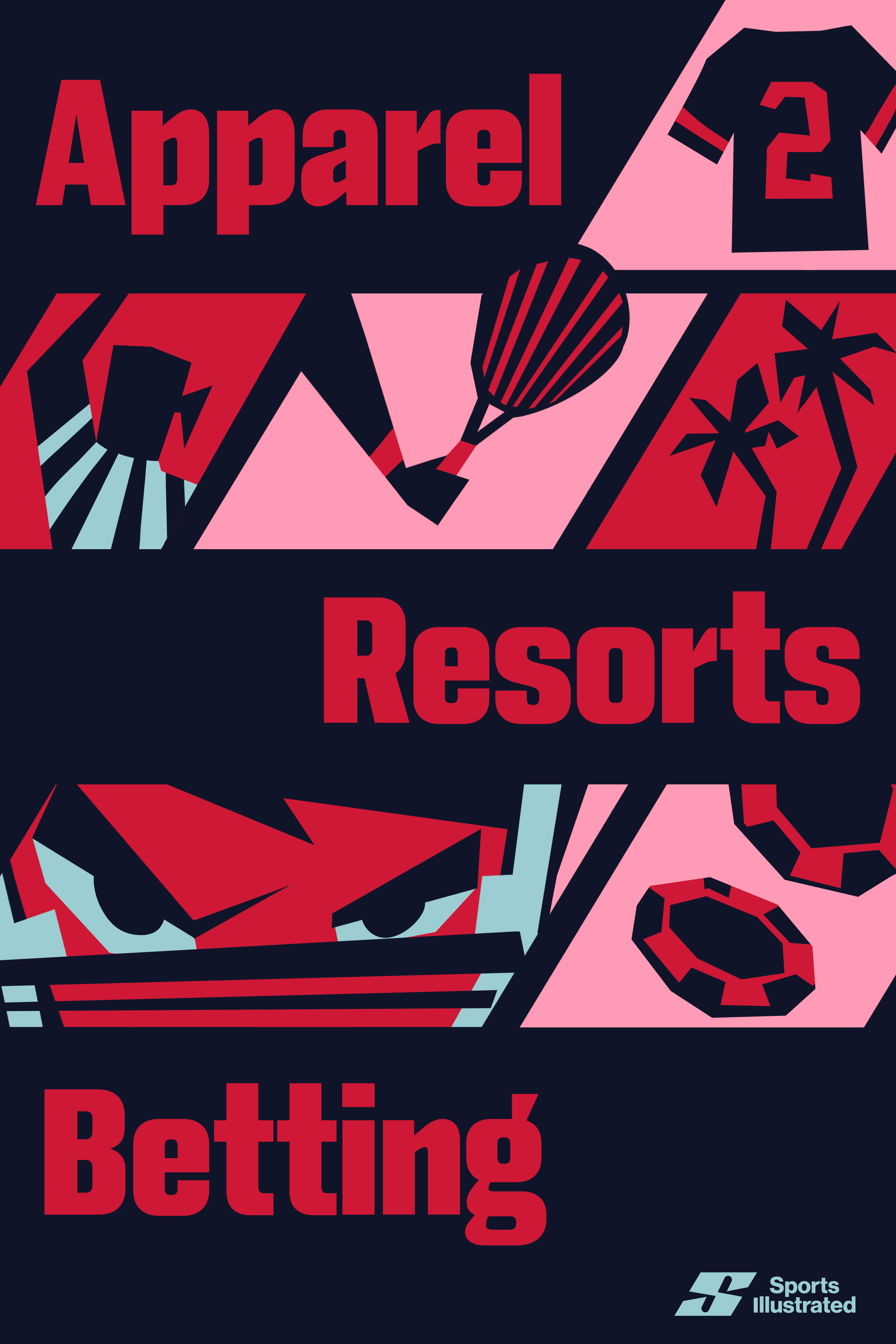
The goal of this rebrand is for Sports Illustrated to be more than just premier sports journalism as the company expands into industries such as hospitality, tourism, betting, apparel, and live shows. Sports Illustrated aims to create a more comprehensive and inclusive brand that caters to all types of sports and sports fans.
Rebrand
Logo
The logo conveys a sense of speed, boldness, and strength. When shifted, the negative space forms the shape of the “I” in Illustrated, and can be seen in the logo animation. As the brand expands into tourism and apparel, the logo had to be legible from a distance as well as scalable.
The logo conveys a sense of speed, boldness, and strength. When shifted, the negative space forms the shape of the “I” in Illustrated, and can be seen in the logo animation. As the brand expands into tourism and apparel, the logo had to be legible from a distance as well as scalable.
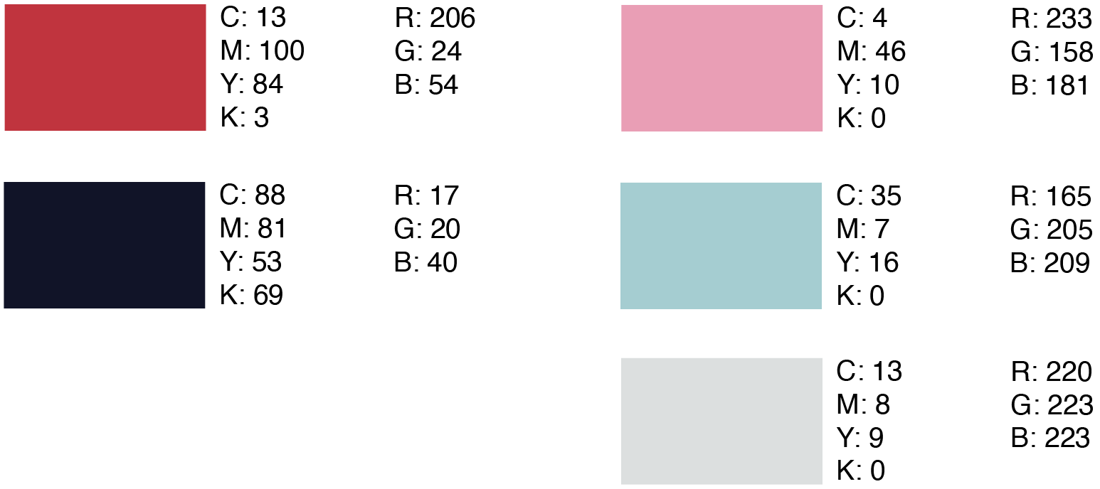
Colors
Being that the brand is known for American premier sports, I used variations of red, white, and blues. I wanted the secondary colors to be fresh, unique from competitors, and show how more feminine colors can be equally powerful.
Brand Elements
I felt having illustrated elements would give the brand more range to work with, whether it’s for resort designs or apparel. They also have an exciting energy that embodies speed, power, but also fun.

Logo Animation


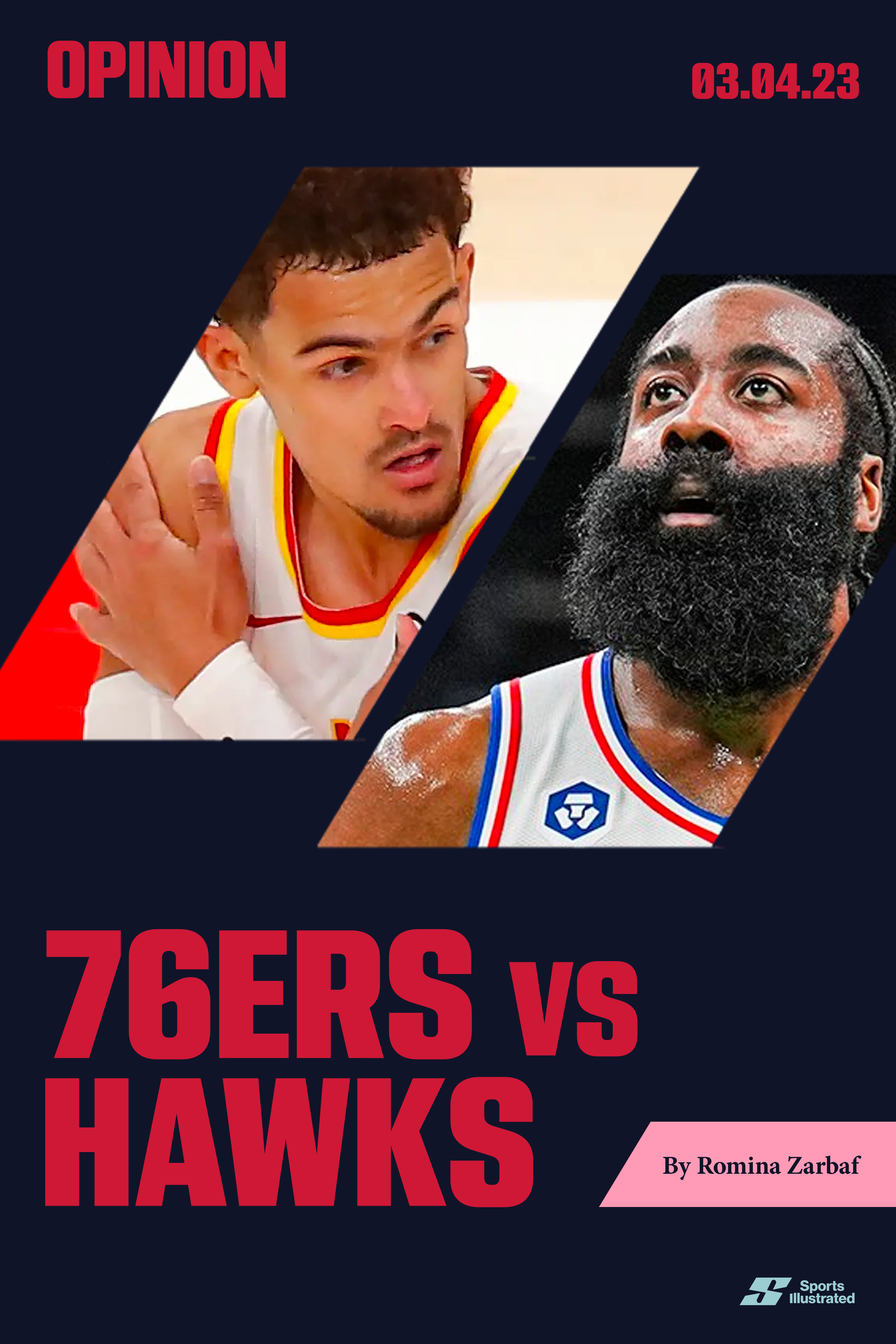
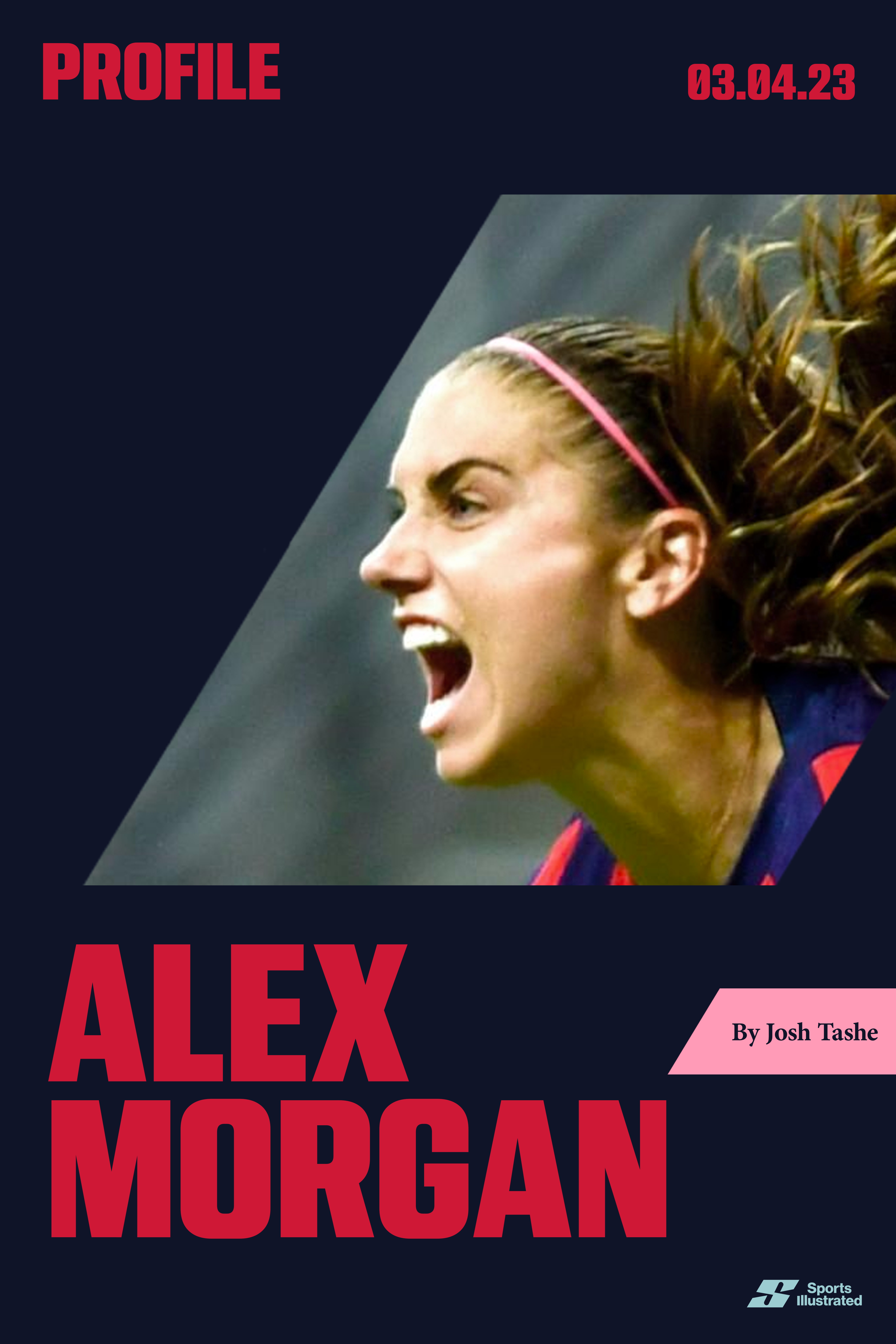
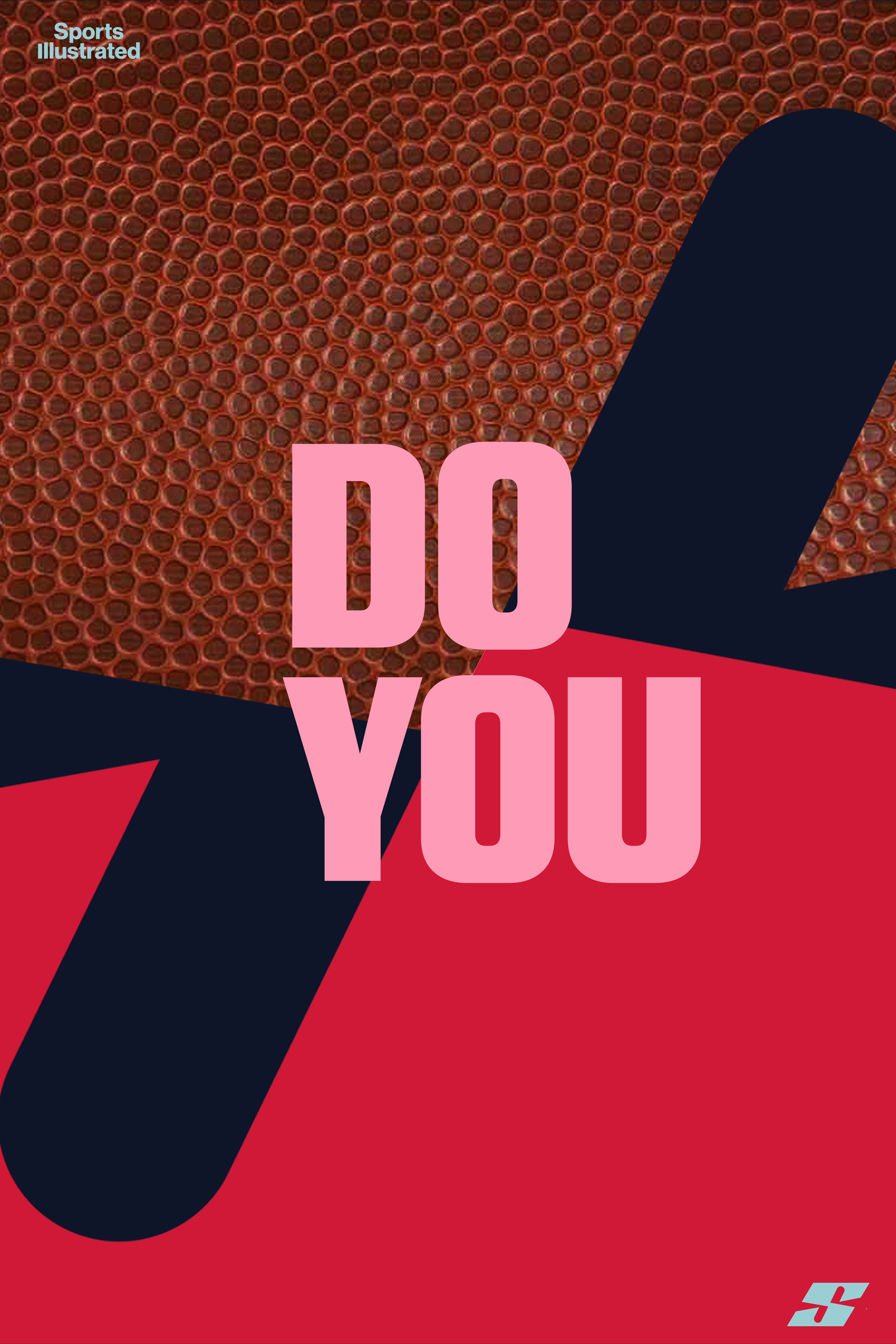
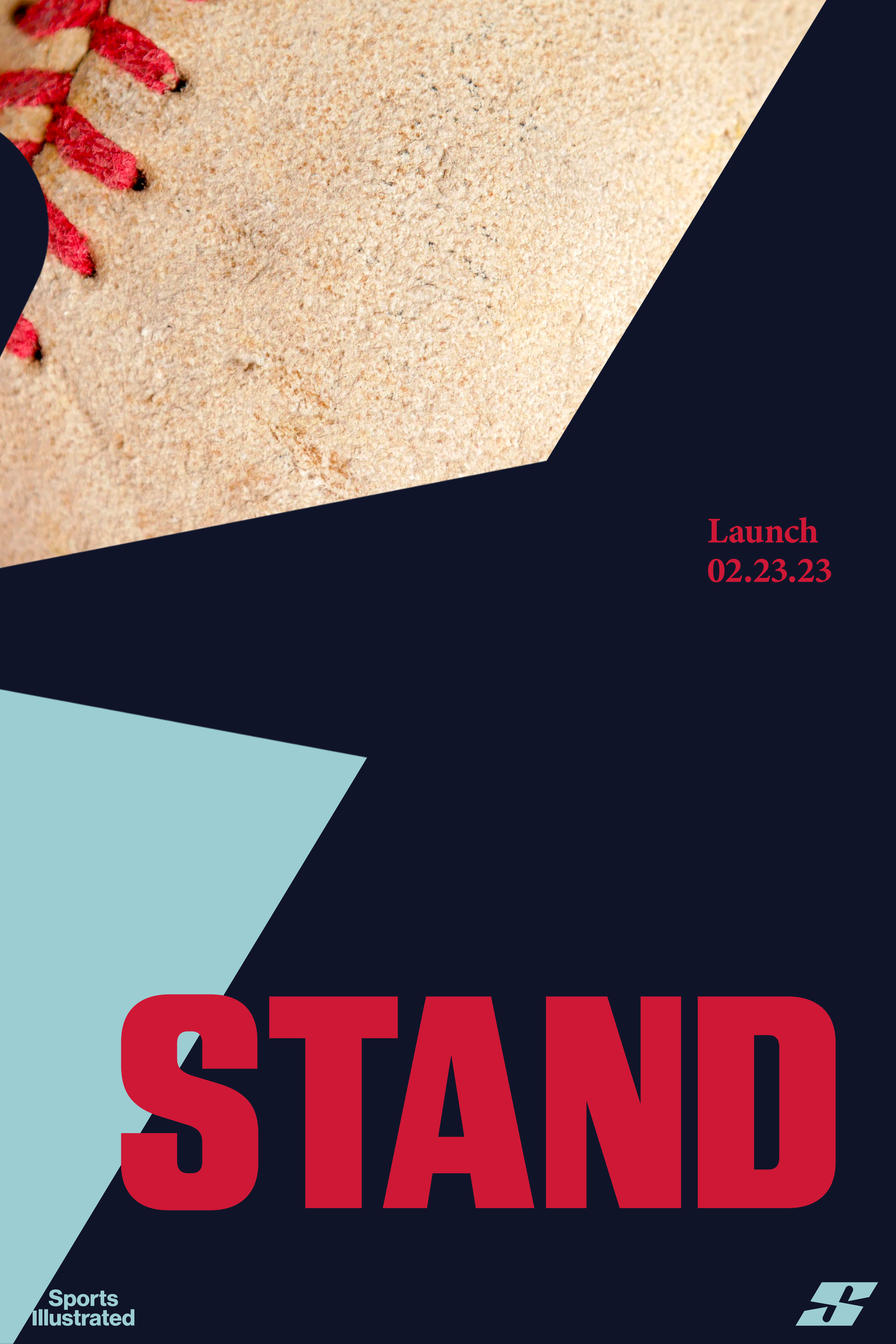
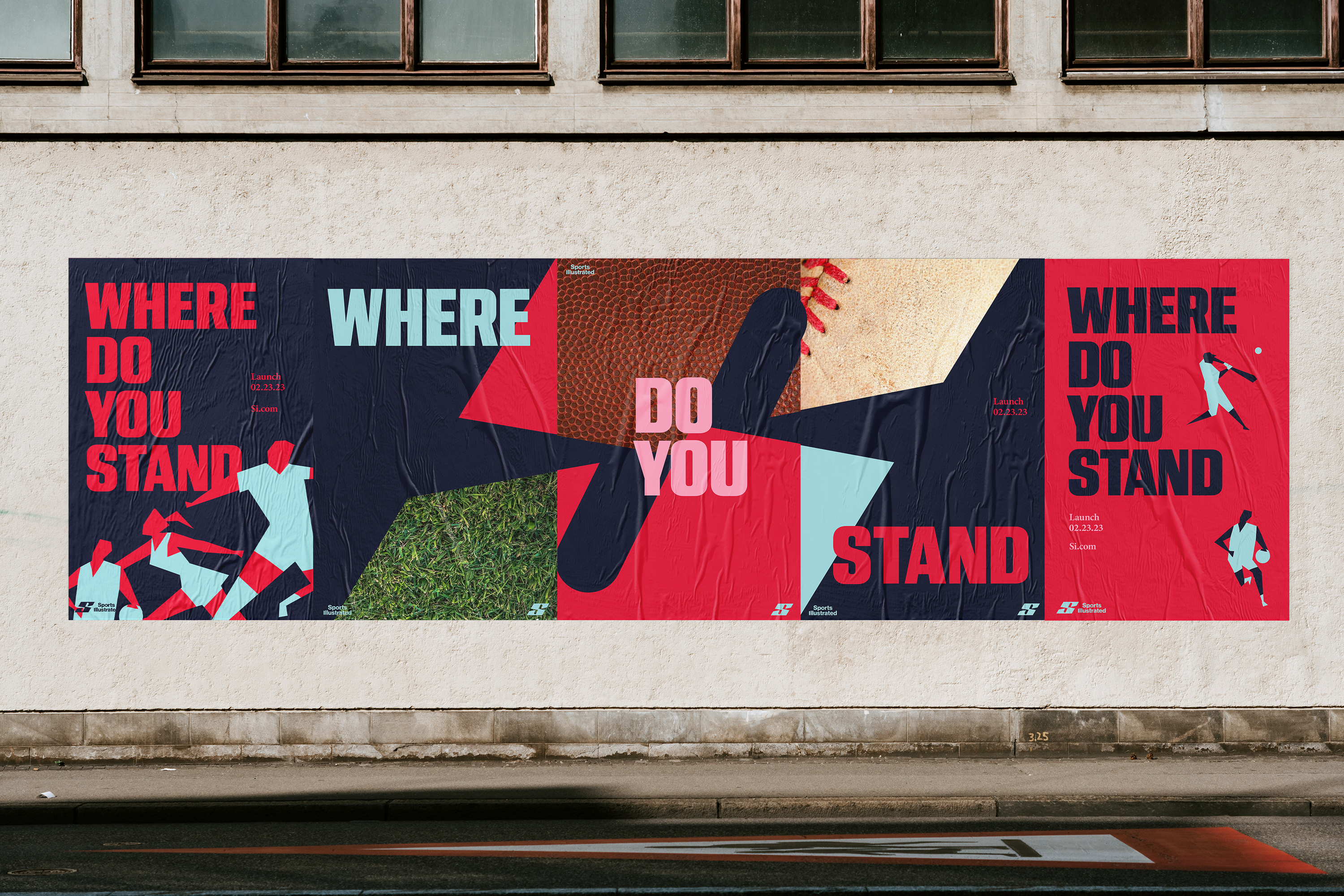
Content Posters
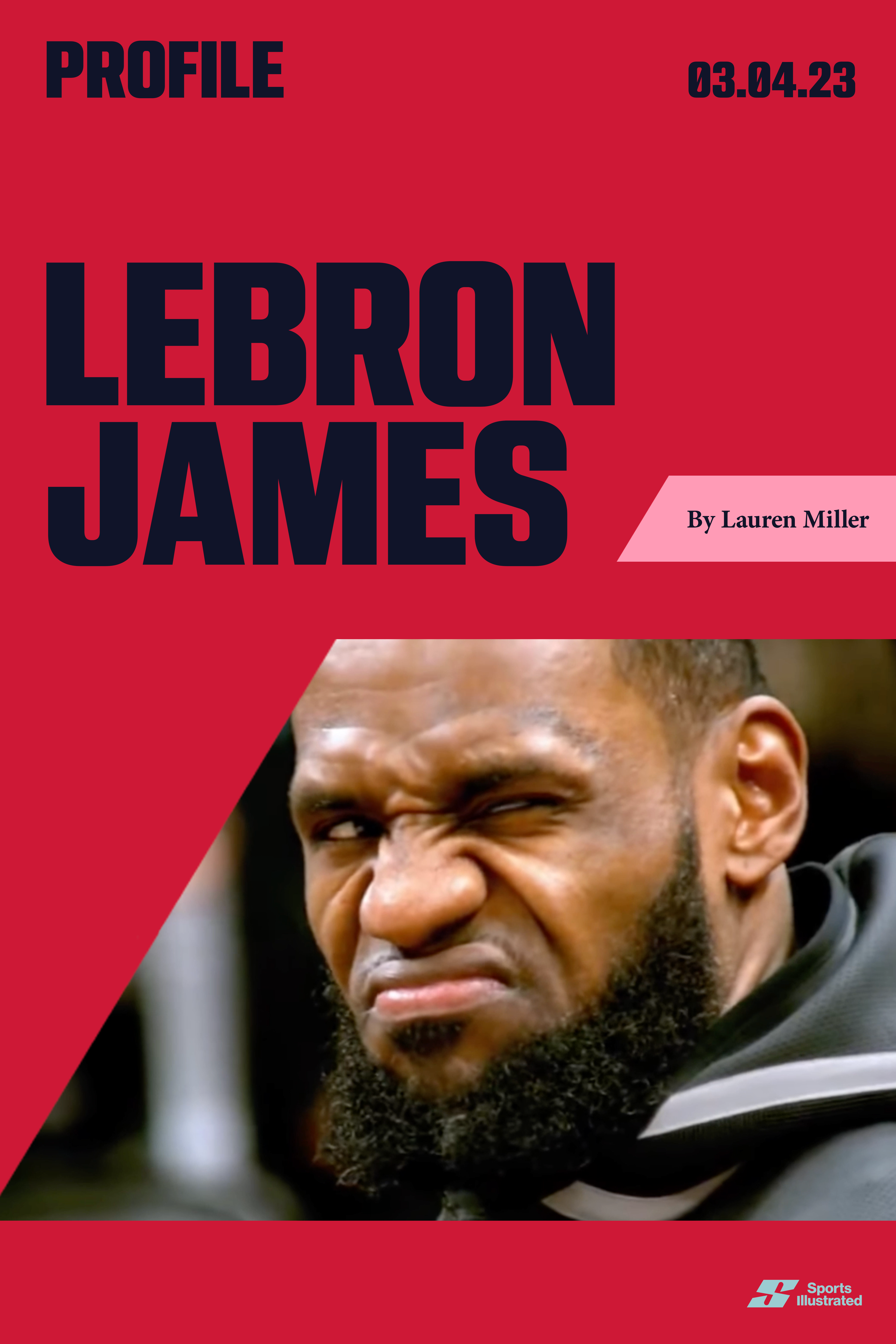

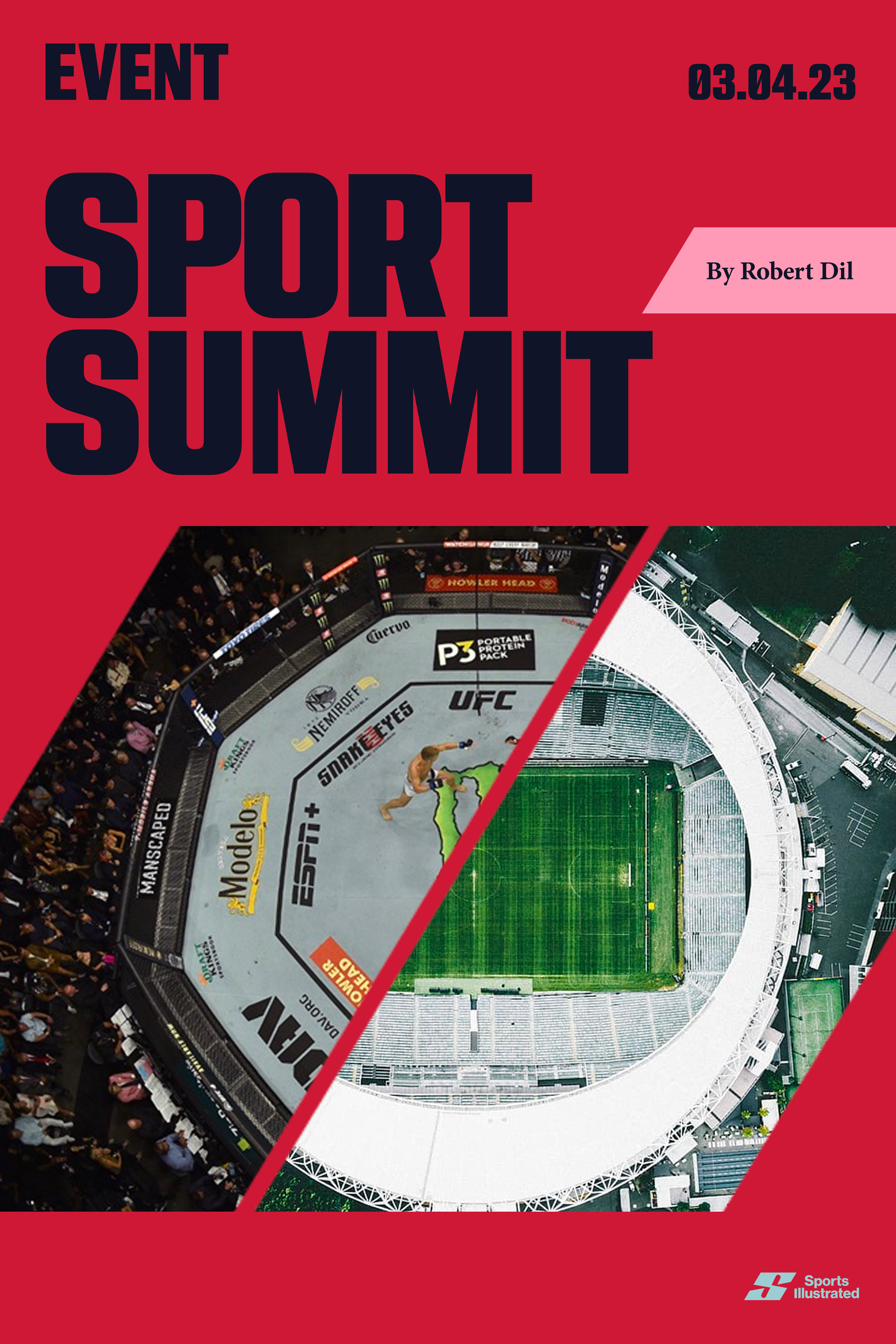

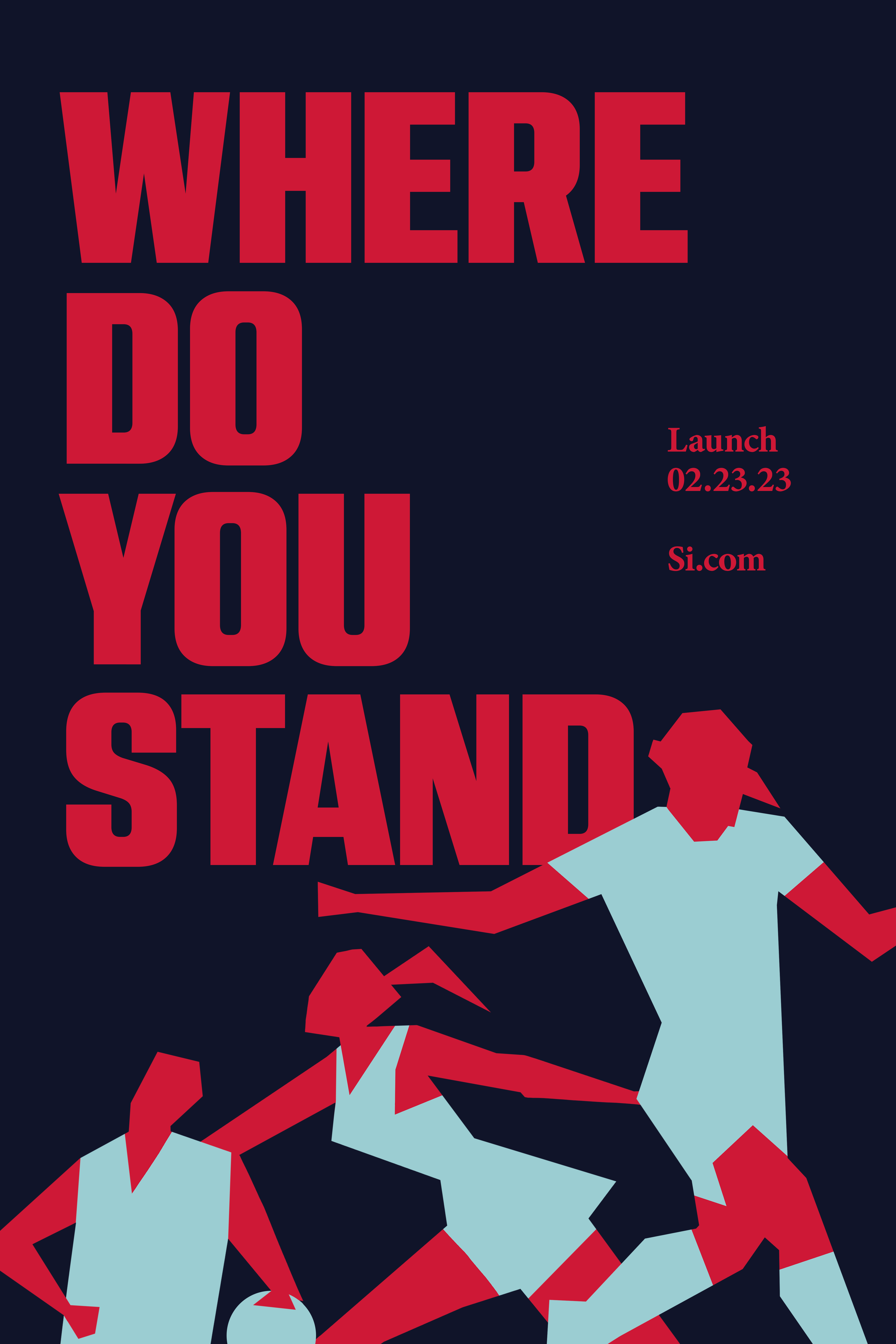
Identity Posters


Environment


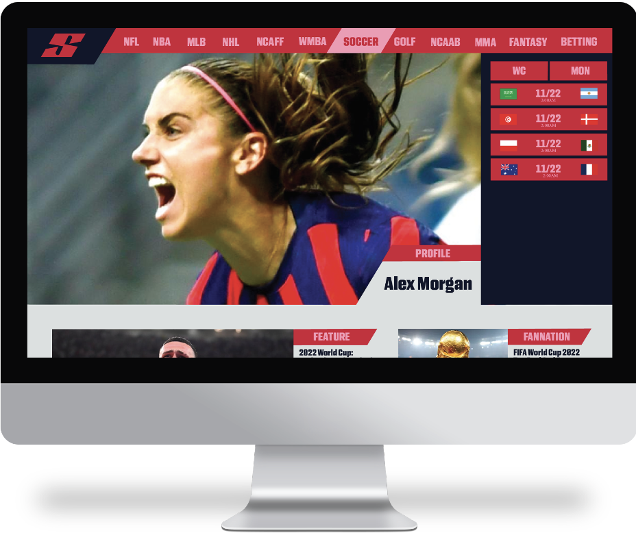
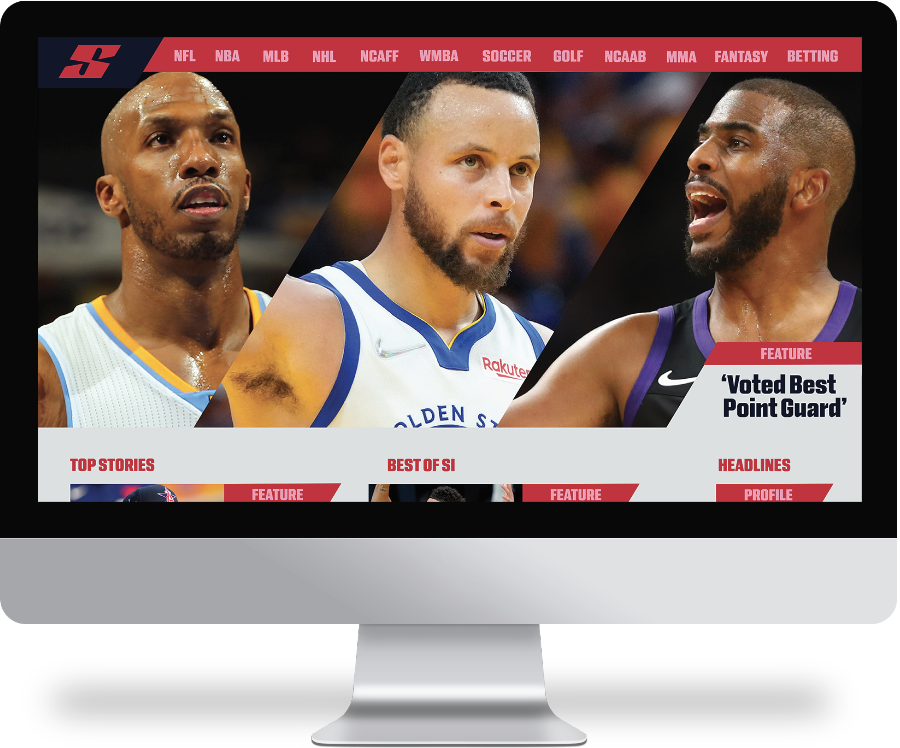
Website

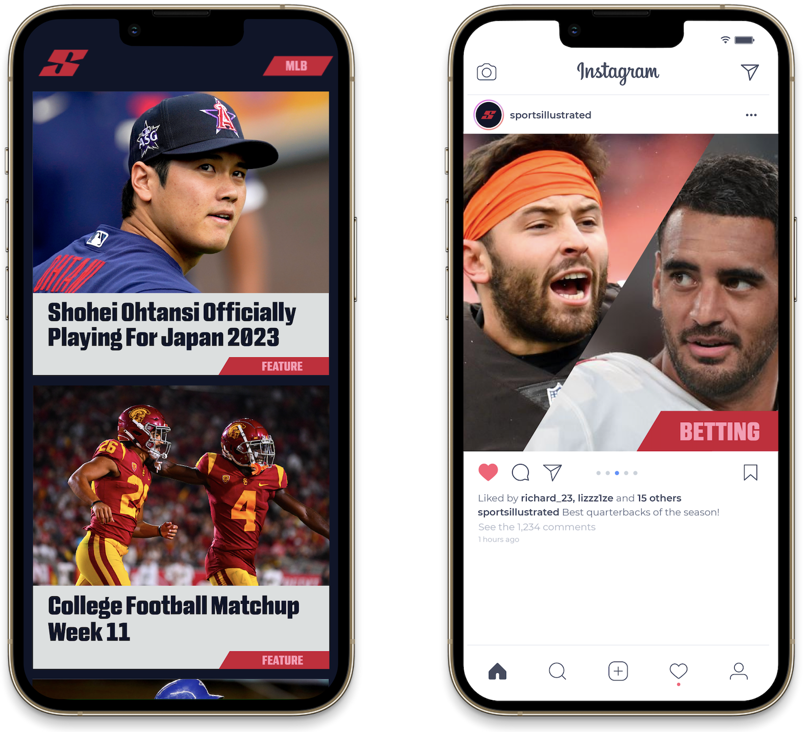
Phone